Category: Techniques
-
Fixing up images in a powerpoint presentation
Ideally you would fix up images before you add them to powerpoint, but what if you have just made a complex powerpoint presentation and realised, for example, that the images all have an undesirable colour cast. And perhaps you have many images in the file with the same issue. Fixing them one by one by […]renfreeshawlab.science.unimelb.edu.au/2025/04/07/fixing-up-images-in-a-powerpoint-presentation
-
Recovering numeric data from an image of a graph
Sometimes all you have is an image file (perhaps from a scanned publication) and you would like to convert the data points to xy coordinates (maybe you want to try an analysis on someone else's data). R gives some tools to help. Here is the start of some code:renfreeshawlab.science.unimelb.edu.au/2020/07/04/recovering-numeric-data-from-an-image-of-a-graph
-
Gene Paint image library
GenePaint is a digital atlas of gene expression patterns in various tissues and species with strong focus on mouse embryos. The in situ section mages are in amazingly high resolution so you can clearly see which cells express the gene of interest.renfreeshawlab.science.unimelb.edu.au/2020/06/11/gene-paint-image-library
-
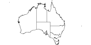
Mapping with R
Easy map making in Rrenfreeshawlab.science.unimelb.edu.au/2020/04/21/mapping-with-r
-
Organising data in Excel for analysis, part 2
Save processing time and manipulate y our data with ease using the Power Query Editor in Excelrenfreeshawlab.science.unimelb.edu.au/2018/09/17/organising-data-in-excel-for-analysis-2
-
Organising data in Excel for analysis
From time to time I get asked to help with a statistical analysis. When I ask for the data I often get a spreadsheet like this. OK, I can read this and sometimes make sense of it, but there are a number of important issues including: With a little bit of learning, this can all […]renfreeshawlab.science.unimelb.edu.au/2018/09/04/organising-data-in-excel-for-analysis
-
Monochrome conversion of colour immunofluorescence or in situ images

It is easy to convert colour immuno or in situ figures to monochrome whilst emphasizing the positive staining colour and repressing the background stain. -
How to get more pixels when you export Powerpoint slides to graphic files
Getting around Microsoft's limitations to export high quality graphics from Powerpoint is not too hard once you know how. -
Prettier graphs using Excel

Excel excels at ugly graphs, However it can produce nice graphs if you know how. It takes a little thought, and a little effort to transform the default graphs, setting sizes, spacing, colours, fonts, formats, but once you are familiar, it takes little time, and once you have a nice format you can even re-use the graph format in different projects - all you need to do is point it to different data sets.renfreeshawlab.science.unimelb.edu.au/2017/03/01/prettier-graphs-using-excel
-
Colourblindness and graphics

About one in ten males (including myself) have some degree of red-green colour blindness (and 0.5% of females), so you should bear that in mind when you are making graphics to display to others. Here are some suggestions for making colour-blindness friendly graphics.renfreeshawlab.science.unimelb.edu.au/2016/10/10/colourblindness-and-graphics
Number of posts found: 22