Ideally you would fix up images before you add them to powerpoint, but what if you have just made a complex powerpoint presentation and realised, for example, that the images all have an undesirable colour cast. And perhaps you have many images in the file with the same issue. Fixing them one by one by adjusting the original and replacing the images in the ppt is tedious. Fortunately, with PPTX files there is an easier approach.
The PPTX file is actually a zipped archive of the files and instructions to compile your presentation. So:
make a copy of the file to work with, perhaps in a separate folder to avoid any confusion
change the extension from .PPTX to .ZIP
use a program such as 7-zip to extract the zipped file to a new folder.
browse the extracted files. You should find a folder called ppt. Open this and locate the subfolder media. Inside this should be all the image files you added to your document.
Adjust the images as needed. In my case, I copied all the media files to a separate folder outside the extracted archive. I loaded images into Adobe Lightroom, adjusted one image, then told lightroom to apply these changes to all the relevant images. That way all the images got exactly the same adjustment. But with programs like Lightroom even adjusting all the images separately is not too time consuming. If you don't have Lightroom, free, open-source programs like Darktable and RawTherapee also allow batch editing.
I then exported the adjusted images back to the original media folder (overwrite the old ones). In LR make sure you are outputting to the same image format and not resizing. I haven't experimented to see what happens if the images are different image formats or resized, but I suspect something may break,
Select all the files and folders in the top level of the archive, and re-combine them into a zip archive. If you are using a program like 7-zip, you can even tell it to save the zip file with a pptx extension.
Now check the file by opening it. Hopefully PPT will open the file and you will see the edited images in place, and all the layout, text etc should be placed as it was in the file you started with.
Below is an example of the top corner of one slide. The whole presentation has 104 images spread over 10 slides, but I only needed to edit a couple and then copy the edits to the remaining images of the same type so the whole process was very much faster than individually editing each image.
Before editsAfter correcting colour cast and exposure
I will take you though some steps that will help get better looking micrographs.
GIMP (GNU Image Manipulation Program ) is a powerful and comprehensive package for image processing, but it comes with a steep learning curve. It does most of the things that Photoshop does (also a steep learning curve) and all for the measly sum of FREE! What a bargain. Grab a copy from https://www.gimp.org.
Open your micrograph using GIMP. The example I am using is a micrograph from Wilson Staples of tammar developing testis stained with Haematoxylin and Eosin. Note the background (outside the tissue section area) is rather yellowish - an issue of the colour balance that will distort your perception of the tissue sample's staining. But a few quick steps this can be fixed.
On the menu choose Colours>>Levels.
This brings up the levels dialog. Select the WHITE eyedropper tool in the lower right.
Now click on an area of the background outside the tissue section, an area that should appear white.
The click should immediately adjust the image so the background is white, and shift the red, green and blue channels so that the whole image now looks to have better colour balance. Click the OK button to save the change.
Now zoom your image to 100% (menu View>>Zoom). Is the image sharp enough. Would a bit of Image sharpening help?
GIMP provides a variety of ways to sharpen, but the simplest is to use the menu Filters>>Enhance>>Sharpen (Unsharp mask).
This brings up a dialog where you can adjust some parameters (make sure the preview check box is ticked so you can see the effect; if needed adjust radius, amount, threshold to tweak the sharpening effect). Search the documentation for full details, but the default settings will probably work OK. Don't overdo it. You are trying to fix unsharpness caused by poor focus, vibration of the microscope during exposure, lens defects etc. If you overdo it you are just introducing artifacts so that the resulting image may not accurately reflect the reality of your specimen. Toggle the preview checkbox to compare the before/after.
Once you are happy with the sharpening effect click OK to apply the filter to the image.
Save your edited image.
Note that in this example there is a large area outside the tissue area to click on to adjust the background colour balance. If you don't have such an area, zoom in on the specimen and look for a clear space between cells - there are usually such areas where you can click.
I managed a couple of successful images with the Waverley Camera Club End of Year competition:
The fly image (below) got the Best Colour EDI (digital image) and one I took in 2005 with my first digital SLR won the president's trophy (subject: wind).
Just accepted by the journal Sexual Development is our paper on echina penile structure with out collaborators at Monash Uni, Currumbin Wildlife Sanctuary and the University of Queensland.
The unique penile morphology of the short-beaked echidna, Tachyglossus aculeatus, by Jane C Fenelon, Caleb McElrea, Geoff Shaw, Alistair Evans, Michael Pyne, Stephen Johnston and Marilyn B Renfree
Monotremes diverged from other mammals approximately 184 million years ago (MYA) and have a number of novel reproductive characteristics. One, in particular, is the unique penile morphology which differs between the echidna and the platypus but which has been suggested to be similar to the structure of the squamate hemipenes. The echidna penis consists of four rosette-glans, each of which contain a termination of the quadfurcate urethra, but it appears that only two of the four glans become erect at any one time. Despite this, there are only a few historical references that examine the structure of the echidna penis, and none that provide an explanation for the mechanisms of unilateral ejaculation. This study confirmed that the echidna penis contains many of the same overall structures and morphology as other mammalian penises and a number of features homologous with reptiles. However, the echidna possesses two distinct corpora spongiosa each of which only surrounds the urethra once the initial urethral bifurcation occurs in the glans penis. Together with the distinct bifurcation of the main penile artery, this provides a mechanism by which directed blood flow to only one corpus spongiosum at a time could dictate unilateral erection.
Sometimes all you have is an image file of a data graph (perhaps from a scanned publication) and you would like to convert the data points to xy coordinates (maybe you want to try an analysis on someone else's data). R gives some tools to help. Here is the start of some code (you need to save the image file as a PNG file; if you don't have software to convert/save images in PNG format, there are many free programs available online including Photoshop, GIMP, Krita, PhotoPea (an online editor that is very photoshop-like), and programs designed as viewers that also handle conversions with aplomb - Xnview, Irfanview etc - a web search will get you to these programs... :
Note there is another variant of this code towards the bottom of the post that is probably better, depending on your needs.
##### VERSION 1 -----

# load library with loadPNG() function
# (install this by un-commenting the next line if it isn't already on your system)
# install.packages("png")
library(png)

# make a new plot window
plot.new()

# read in an image file
img=readPNG("fig.png")

# paint the image onto the plot area.
rasterImage(img,0,0,1,1)

# use the locator() function to get the xy coordinates of points
# that you click on the plot.  At this point R goes into interactive mode.
#in RStudio the top of the plot window will show "Locator active (Esc to finish)
out=locator(100,"p")
# click on the points (here the maximum points to collect is set at 100,
# and "p" says draw a circle on the plot where ever you click.
# Each time you click the xy coordinates are added to the variable out.
# when you are done, press the Esc key.

# now show the values you collected. In this case I collected 3 clicks.
#
out
$x
[1] 0.1729519 0.1744344 0.1877773

$y
[1] 0.7589416 0.3948941 0.5566592
If you start your clicking with clicks on tick marks at each end of the y axis and x axis you will then have reference points to allow you to map the subsequent xy coordinates from pixels down and across from the top left, into whatever units the graph uses.
If you have a graph with discrete points on it, instead of the locator() function you can use the identify() function which will look close to where you click for a plot symbol, and return the coordinates of that plot symbol, so you don't need to be so precise with your clicks - R will do the fine adjusting for you.
In the example code above the output shows 3 x coordinates and 3 matching y coordinates. These represent the x-y coordinates of the points in the order you clicked them (so it pays to be systematic in the order you click them). My approach is to paste these numbers into excel - the x and y coordinates will paste as a text string into a single cell. Use the tools>>text to columns menu item and split the text into columns using delimeter "space". You should now have x and y coordinates of the points running across the columns from left to right. Note that these numbers are the position on the original image with the top left point being (0,0) in this coordinate system and the bottom right (1,1)
You might prefer copy and paste-special-transpose to get the data into x and y columns:
Now, let's just assume that the first two coordinates represent the Y axis 100 and 0 respectively, you can use simple arithmetic to generate the corresponding y values for all the points below (same principle applies for x values if you have reference coordinates for the x axis)
A simple calculation as above will give you the Y value calculated from the Y-axis data. The relevant formula is shown in text in the cell D7. Note the use of $C$5 etc so you can copy the formula down to convert the XY locations to more cells below (which would be the usual case. If you have an xy scatterplot and want to interpolate the x values to go with the y values, you can make the same sort of calculations once you have chosen relevant points on the x-axis to serve as reference values for the calculation.
Note that the R code above is just a stub. It would be straight forward to do the calculations in R if you wanted to, and even pass the resulting interpolated values to relevant statistical or graphing routines within R. R has has some very powerful and customisable graphics capabilities far beyond the primitive stuff in Excel. But I will leave that to the individual reader so they can customise the code to suit their needs. There are lots of guides and tutorials on making beautiful graphs in R.
Another update that simplifies the interpolation... a modified script that probably speeds thing is below, with explanation following.
##### VERSION 2 - automatic interpolation so long as you edit the appropriate bits of this code and trim the graph image to suit -----

# load library with loadPNG() function
# (install this by un-commenting the next line if it isn't already on your system)
# install.packages("png")
library(png)

# make a new plot window
plot.new()

plot(x=c(0,18),y=c(0,4),xlim=c(0,18),ylim=c(0,4))

# read in an image file
img=readPNG("testgraph-crop.png")

# paint the image onto the plot area.
rasterImage(img,0,0,18,4,interpolate=TRUE)

# use the locator() function to get the xy coordinates of points
# that you click on the plot.  At this point R goes into interactive mode.
#in RStudio the top of the plot window will show "Locator active (Esc to finish)
out=locator(100,"p")
# click on the points (here the maximum points to collect is set at 100,
# and "p" says draw a circle on the plot where ever you click.
# Each time you click the xy coordinates are added to the variable out.
# when you are done, press the Esc key.

# now show the values you collected. In this case I collected 3 clicks.
#
out
OK this is crude test code modifications I used with the following graph
Note the Y axis covers 0-4 and X covers 0-18. Crop the graph to just the (x,y) 0,0 to18,4 and use this cropped graph to import into the script.
The revised code first plots a dummy graph with the same x and y range. I have bolded the bits you will need to change to suit the s and y range of your own graphs:
plot(x=c(0,18),y=c(0,4),xlim=c(0,18),ylim=c(0,4))
it then reads in the cropped graph image and overlays it onto the plot area:
# read in an image file
img=readPNG("testgraph.png")

# paint the image onto the plot area.
rasterImage(img,0,0,18,4,interpolate=TRUE)
Now, when you click on points, R will interpolate and the x,y values you get should be close to the expected values from the original axes.
Expression patterns are determined by non-radioactive in situ hybridization on serial tissue sections.
The database is gene-centric and entries can be searched either by gene name, accession number, sequence homology or site of expression. The website features a "virtual microscope" that enables zooming into images down to cellular resolution.
It has incredibly high resolution images (down to cellular level if you zoom in enough) showing amazing embryo sections with in situ staining for a huge set of genes.
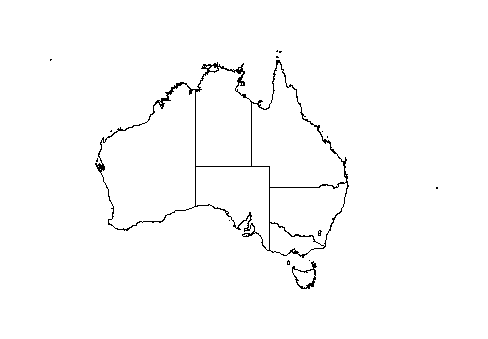
I recently had to make some maps of species distributions. To avoid copyright issues from copying other people's maps you can use Open Street Map (https://www.openstreetmap.org) which provides open source maps, but if you want just plain country outline maps without all the clutter, you can make these quickly using R from freely available packages and datasets. One that is good for Australia is package ozmaps. A couple of lines of code will generate a nice map of Australia (with or without state boundaries).
library(ozmaps)
ozmap()
ozmap("country") # gives outline without state borders
The resulting map can be exported as PDF (this exports as a vector image that you can zoom to the desired size, import into photoshop or illustrator (or alternatives like GIMP and Inkscape) for further manipulation. In R you can add other shapes (outlines of polygons in latitude/longitude lists) etc.
If you want to skip the intermediate steps, you can export the map directly from R to an SVG vector graphic file that you can import into Powerpoint for further manipulation.
svg(filename = "test3.svg")    # send output to an SVG file with the name specified
ozmap(lwd=1)                   # draw the map (lwd=1 specifies a thin line width)
dev.off()                      # finish writing to the file and close it.
Now, import the SVG file into Powerpoint as an image (menu: INSERT>>Image). resize the image on the page to the desired size. Ungroup the image to detach the map from the svg page background. Ungroup again to get the various vector parts ungrouped, if you want to adjust line colour or thickness or shape fill, you can select the parts and adjust as desired. Here is a map I have adjusted the fill colours on:
Now, you might want to add some embellishments like, say, selecting just a part of the map. This is easily achieved within PowerPoint using the Merge Shapes tool. For example, perhaps you want just the part around Victoria on your map. Make a country outline map SVG file, paste into PPT, ungroup and set line and fill as desired. Use the draw rectangle tool to make a box over the desired area. Shift-click to add the selection of the country outline.
Now use the Merge-Shapes >> Intersect. from the Shape-Format menu.
Have a play. You can use the shape drawing tools to make arbitrary polygonal or smoothed polygon shapes etc. The Merge shapes tools don't work with grouped shapes or with too many shapes, so you may need to tidy up the result by deleting all the left over island shapes etc that weren't used in the shape-union. Since the lines are imported as vectors, you can resize to make the shapes bigger without getting pixelated.
Want maps of elsewhere? There are lots more options. The code below uses different packages to plot a map of Australia, Papua and Indonesia, for example. start and end this with the svg(filename) and dev.off() code as illustrated above to get svg output.
library(maps)
library(mapdata)
library(sp)

aus<-  map(database = "worldHires",
         regions = c("Australia","papua","indonesia"),
         fill=FALSE,
         xlim=c(100,170), # longitude range
         ylim=c(-45,-0),  # latitude range
         mar=c(0,0,0,0),
         plot = TRUE,
         resolution = 0,
         lwd=3  # line width
         )
I've added a scan of the cover page for our Reproduction Down Under conference volume in Reproduction, Fertility and Development (Vol 31 part 1, 2019). The cover images and graphic design all from our lab.
I received an envelope today clearly marked “do not bend” and looking like a herd of mastodons had walked over it. Inside was my certificate for my AAPS (Associate of the Australian Photographic Society), "recognising my photographic skill and artistry."
It's only taken 12 months since I accumulated the necessary complement of international photographic competition acceptances and awards, but that was mainly through missing last year's deadline because I was traveling overseas.
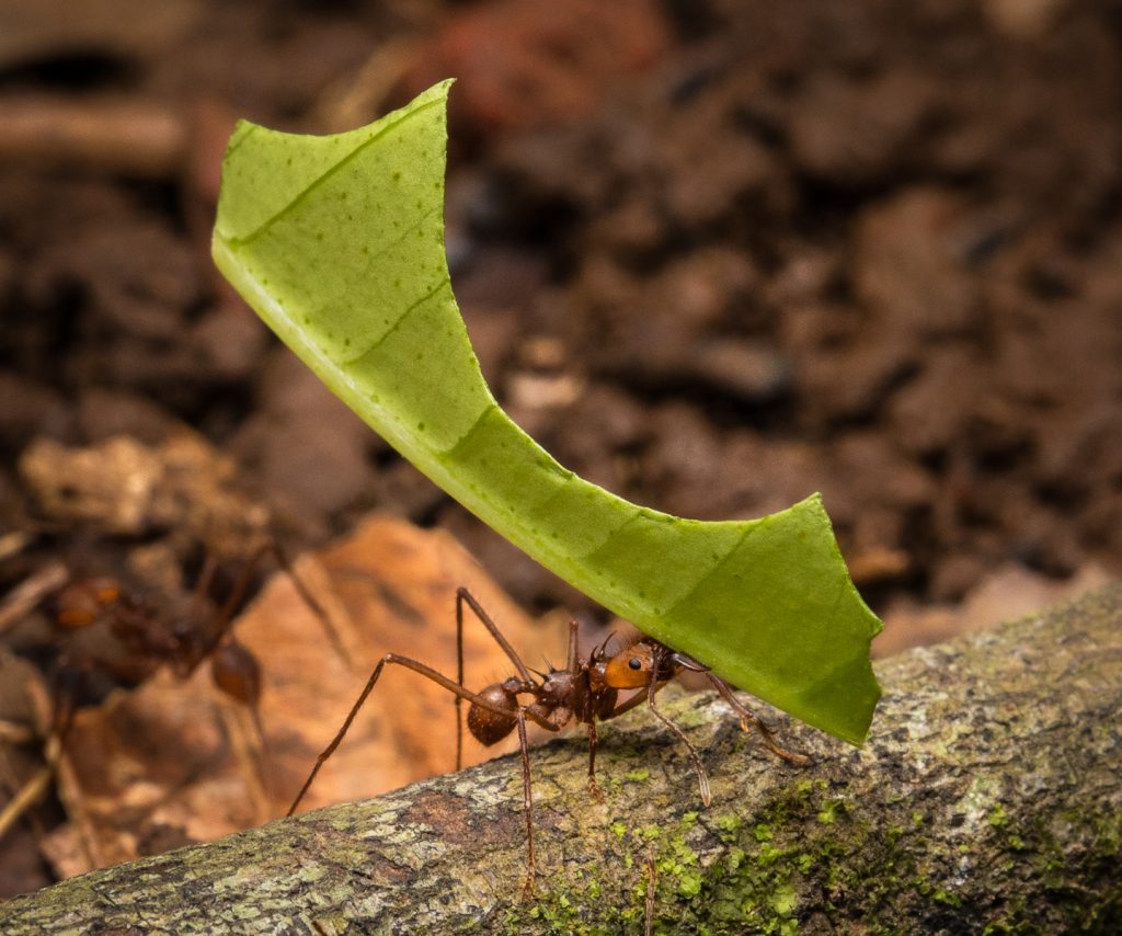
I was pleased to receive the Gold Medal award for my photo of a leaf cutter ant in Costa Rica in the Australian Photographic Society 5th Nature National – INVERTEBRATES 2018.